import geopandas as gpd
import matplotlib.pyplot as pltRegionalization
db = gpd.read_file("~/data/shared/sandiego_tracts.gpkg")db.head()| GEOID | median_age | total_pop | total_pop_white | tt_work | hh_total | hh_female | total_bachelor | median_hh_income | income_gini | ... | state | county | tract | area_sqm | pct_rented | pct_hh_female | pct_bachelor | pct_white | sub_30 | geometry | |
|---|---|---|---|---|---|---|---|---|---|---|---|---|---|---|---|---|---|---|---|---|---|
| 0 | 06073018300 | 37.1 | 2590.0 | 2375.0 | 1299.0 | 2590.0 | 137.0 | 0.0 | 62500.0 | 0.5355 | ... | 06 | 073 | 018300 | 2.876449 | 0.373913 | 0.052896 | 0.000000 | 0.916988 | False | POLYGON ((-13069450.120 3922380.770, -13069175... |
| 1 | 06073018601 | 41.2 | 5147.0 | 4069.0 | 1970.0 | 5147.0 | 562.0 | 24.0 | 88165.0 | 0.4265 | ... | 06 | 073 | 018601 | 4.548797 | 0.205144 | 0.109190 | 0.004663 | 0.790558 | False | POLYGON ((-13067719.770 3922939.420, -13067631... |
| 2 | 06073017601 | 54.4 | 5595.0 | 4925.0 | 1702.0 | 5595.0 | 442.0 | 34.0 | 110804.0 | 0.4985 | ... | 06 | 073 | 017601 | 8.726275 | 0.279029 | 0.078999 | 0.006077 | 0.880250 | False | POLYGON ((-13058166.110 3907247.690, -13058140... |
| 3 | 06073019301 | 42.3 | 7026.0 | 5625.0 | 3390.0 | 7026.0 | 638.0 | 46.0 | 100539.0 | 0.4003 | ... | 06 | 073 | 019301 | 3.519743 | 0.196512 | 0.090806 | 0.006547 | 0.800598 | False | POLYGON ((-13056896.290 3925255.610, -13056868... |
| 4 | 06073018700 | 21.8 | 40402.0 | 30455.0 | 24143.0 | 40402.0 | 2456.0 | 23.0 | 41709.0 | 0.3196 | ... | 06 | 073 | 018700 | 559.150793 | 0.949887 | 0.060789 | 0.000569 | 0.753799 | False | POLYGON ((-13090788.510 3946435.430, -13090736... |
5 rows × 25 columns
db.plot()<Axes: >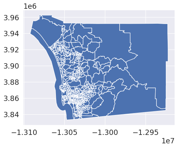
cluster_variables = [
"median_house_value", # Median house value
"pct_white", # % tract population that is white
"pct_rented", # % households that are rented
"pct_hh_female", # % female-led households
"pct_bachelor", # % tract population with a Bachelors degree
"median_no_rooms", # Median n. of rooms in the tract's households
"income_gini", # Gini index measuring tract wealth inequality
"median_age", # Median age of tract population
"tt_work", # Travel time to work
]f, axs = plt.subplots(nrows=3, ncols=3, figsize=(12, 12))
# Make the axes accessible with single indexing
axs = axs.flatten()
# Start a loop over all the variables of interest
for i, col in enumerate(cluster_variables):
# select the axis where the map will go
ax = axs[i]
# Plot the map
db.plot(
column=col,
ax=ax,
scheme="Quantiles",
linewidth=0,
cmap="RdPu",
)
# Remove axis clutter
ax.set_axis_off()
# Set the axis title to the name of variable being plotted
ax.set_title(col)
# Display the figure
plt.show()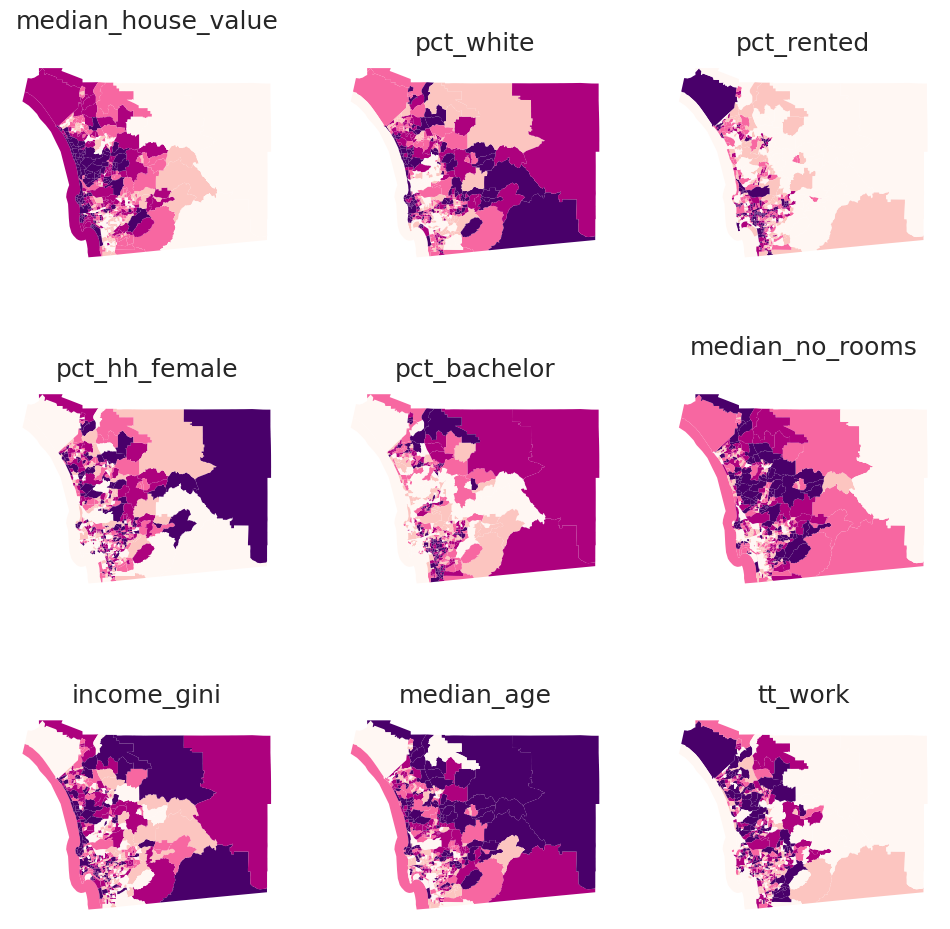
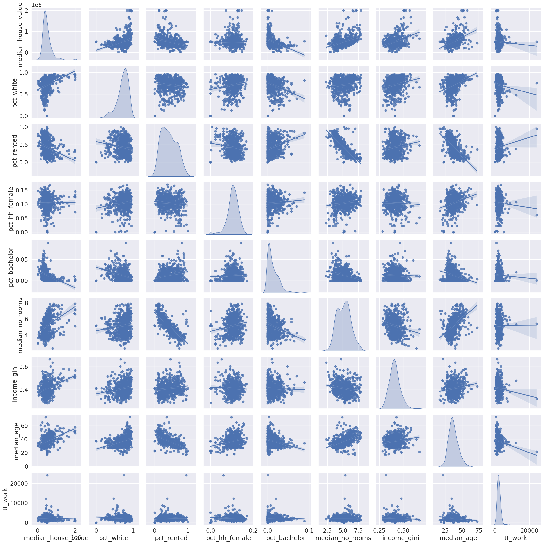
import seaborn_ = seaborn.pairplot(
db[cluster_variables], kind="reg", diag_kind="kde"
)
db[["income_gini", "median_house_value"]].head()| income_gini | median_house_value | |
|---|---|---|
| 0 | 0.5355 | 732900.000000 |
| 1 | 0.4265 | 473800.000000 |
| 2 | 0.4985 | 930600.000000 |
| 3 | 0.4003 | 478500.000000 |
| 4 | 0.3196 | 515570.896382 |
from sklearn import metricsmetrics.pairwise_distances(
db[["income_gini", "median_house_value"]].head()
).round(4)array([[ 0. , 259100. , 197700. , 254400. , 217329.1036],
[259100. , 0. , 456800. , 4700. , 41770.8964],
[197700. , 456800. , 0. , 452100. , 415029.1036],
[254400. , 4700. , 452100. , 0. , 37070.8964],
[217329.1036, 41770.8964, 415029.1036, 37070.8964, 0. ]])from sklearn.preprocessing import robust_scaledb_scaled = robust_scale(db[cluster_variables])cluster_variables['median_house_value',
'pct_white',
'pct_rented',
'pct_hh_female',
'pct_bachelor',
'median_no_rooms',
'income_gini',
'median_age',
'tt_work']metrics.pairwise_distances(
db_scaled[:5,:]
).round(4)array([[ 0. , 3.3787, 2.792 , 3.6903, 19.0006],
[ 3.3787, 0. , 2.9241, 1.3899, 18.3732],
[ 2.792 , 2.9241, 0. , 3.1615, 18.9427],
[ 3.6903, 1.3899, 3.1615, 0. , 17.19 ],
[19.0006, 18.3732, 18.9427, 17.19 , 0. ]])db_scaledarray([[ 1.16897565, 0.88747229, -0.07925532, ..., 1.93719258,
0.1011236 , -0.6982584 ],
[ 0.08123426, 0.20084202, -0.54215204, ..., 0.28755202,
0.56179775, -0.15471851],
[ 1.99895046, 0.68795166, -0.33950017, ..., 1.37722285,
2.04494382, -0.37181045],
...,
[-0.02581864, 1.04512769, -0.79870967, ..., -1.11842603,
0.93258427, -0.04860267],
[ 0.20969773, 0.56397715, -0.83360459, ..., -0.03783579,
1.1011236 , -0.63831511],
[-1.24118388, 0.4812156 , -0.84270269, ..., 0.51608021,
2.74157303, -1.1891454 ]])db_scaled.shape(628, 9)k-means
from sklearn.cluster import KMeanskmeans = KMeans(n_clusters=5)
import numpy as np
np.random.seed(1234)
k5cls = kmeans.fit(db_scaled)k5cls.labels_[:5]array([2, 1, 3, 1, 4], dtype=int32)# Assign labels into a column
db["k5cls"] = k5cls.labels_
# Set up figure and ax
f, ax = plt.subplots(1, figsize=(9, 9))
# Plot unique values choropleth including
# a legend and with no boundary lines
db.plot(
column="k5cls", categorical=True, legend=True, linewidth=0, ax=ax
)
# Remove axis
ax.set_axis_off()
# Display the map
plt.show()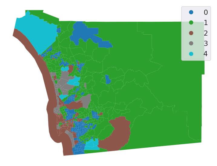
# Group data table by cluster label and count observations
k5sizes = db.groupby("k5cls").size()
k5sizes
k5cls
0 248
1 244
2 88
3 39
4 9
dtype: int64# Dissolve areas by Cluster, aggregate by summing,
# and keep column for area
areas = db.dissolve(by="k5cls", aggfunc="sum")["area_sqm"]
areask5cls
0 739.184478
1 8622.481814
2 1335.721492
3 315.428301
4 708.956558
Name: area_sqm, dtype: float64import pandas
# Bind cluster figures in a single table
area_tracts = pandas.DataFrame({"No. Tracts": k5sizes, "Area": areas})
# Convert raw values into percentages
area_tracts = area_tracts * 100 / area_tracts.sum()
# Bar plot
ax = area_tracts.plot.bar()
# Rename axes
ax.set_xlabel("Cluster labels")
ax.set_ylabel("Percentage by cluster");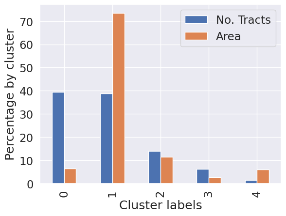
# Group table by cluster label, keep the variables used
# for clustering, and obtain their mean
k5means = db.groupby("k5cls")[cluster_variables].mean()
# Transpose the table and print it rounding each value
# to three decimals
k5means.T.round(3)| k5cls | 0 | 1 | 2 | 3 | 4 |
|---|---|---|---|---|---|
| median_house_value | 356997.331 | 538463.934 | 544888.738 | 1292905.256 | 609385.655 |
| pct_white | 0.620 | 0.787 | 0.741 | 0.874 | 0.583 |
| pct_rented | 0.551 | 0.270 | 0.596 | 0.275 | 0.377 |
| pct_hh_female | 0.108 | 0.114 | 0.065 | 0.109 | 0.095 |
| pct_bachelor | 0.023 | 0.007 | 0.005 | 0.002 | 0.007 |
| median_no_rooms | 4.623 | 5.850 | 4.153 | 6.100 | 5.800 |
| income_gini | 0.400 | 0.397 | 0.449 | 0.488 | 0.391 |
| median_age | 32.783 | 42.057 | 32.590 | 46.356 | 33.500 |
| tt_work | 2238.883 | 2244.320 | 2349.511 | 1746.410 | 9671.556 |
# Index db on cluster ID
tidy_db = db.set_index("k5cls")
# Keep only variables used for clustering
tidy_db = tidy_db[cluster_variables]
# Stack column names into a column, obtaining
# a "long" version of the dataset
tidy_db = tidy_db.stack()
# Take indices into proper columns
tidy_db = tidy_db.reset_index()
# Rename column names
tidy_db = tidy_db.rename(
columns={"level_1": "Attribute", 0: "Values"}
)
# Check out result
tidy_db.head()| k5cls | Attribute | Values | |
|---|---|---|---|
| 0 | 2 | median_house_value | 732900.000000 |
| 1 | 2 | pct_white | 0.916988 |
| 2 | 2 | pct_rented | 0.373913 |
| 3 | 2 | pct_hh_female | 0.052896 |
| 4 | 2 | pct_bachelor | 0.000000 |
# Scale fonts to make them more readable
seaborn.set(font_scale=1.5)
# Setup the facets
facets = seaborn.FacetGrid(
data=tidy_db,
col="Attribute",
hue="k5cls",
sharey=False,
sharex=False,
aspect=2,
col_wrap=3,
)
# Build the plot from `sns.kdeplot`
_ = facets.map(seaborn.kdeplot, "Values", fill=True).add_legend()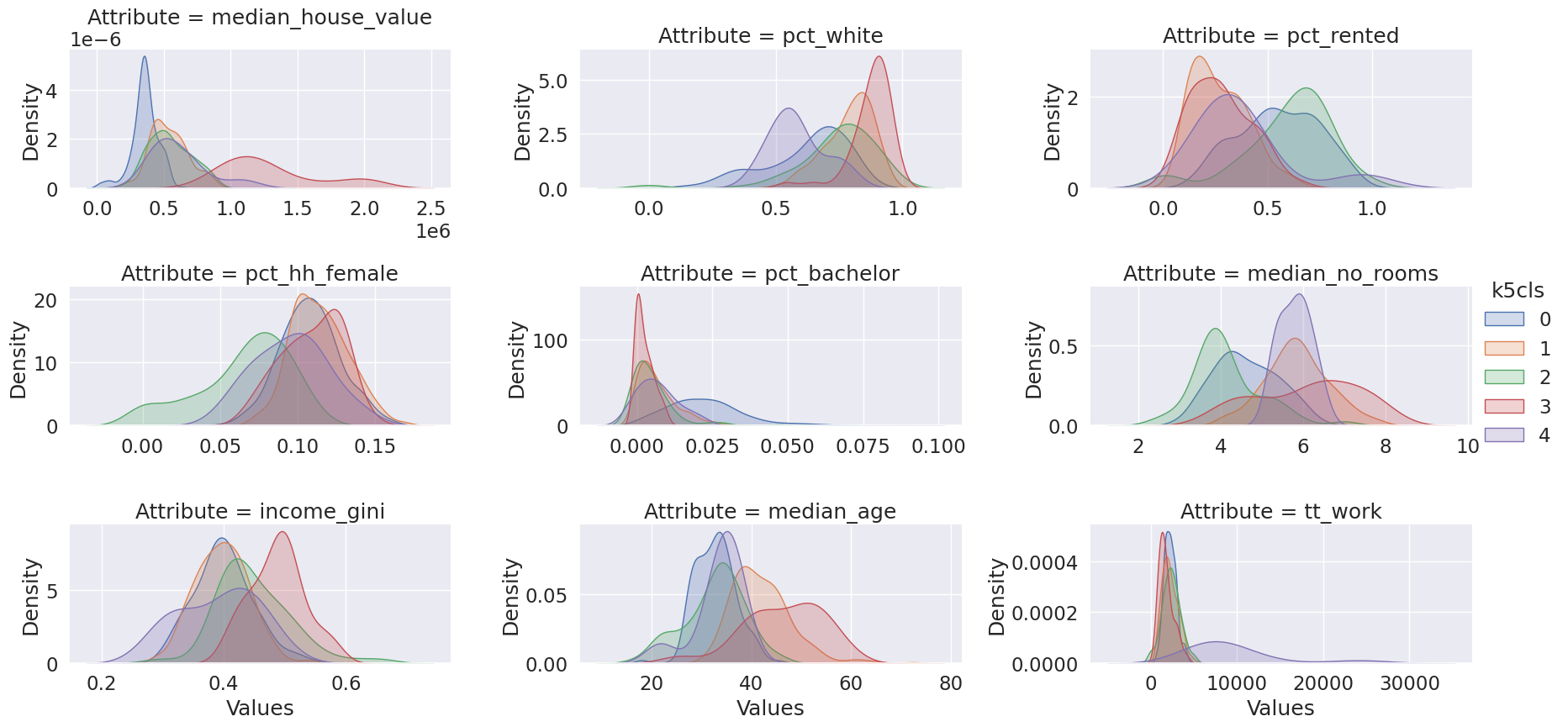
Agglomerative Clustering
from sklearn.cluster import AgglomerativeClustering# Set seed for reproducibility
np.random.seed(0)
# Initialize the algorithm
model = AgglomerativeClustering(linkage="ward", n_clusters=5)
# Run clustering
model.fit(db_scaled)
# Assign labels to main data table
db["ward5"] = model.labels_ward5sizes = db.groupby("ward5").size()
ward5sizesward5
0 198
1 10
2 48
3 287
4 85
dtype: int64ward5means = db.groupby("ward5")[cluster_variables].mean()
ward5means.T.round(3)| ward5 | 0 | 1 | 2 | 3 | 4 |
|---|---|---|---|---|---|
| median_house_value | 365932.350 | 625607.090 | 1202087.604 | 503608.711 | 503905.198 |
| pct_white | 0.589 | 0.598 | 0.871 | 0.770 | 0.766 |
| pct_rented | 0.573 | 0.360 | 0.285 | 0.287 | 0.657 |
| pct_hh_female | 0.105 | 0.098 | 0.107 | 0.112 | 0.076 |
| pct_bachelor | 0.023 | 0.006 | 0.002 | 0.009 | 0.006 |
| median_no_rooms | 4.566 | 5.860 | 6.010 | 5.738 | 3.904 |
| income_gini | 0.405 | 0.394 | 0.480 | 0.394 | 0.442 |
| median_age | 31.955 | 34.250 | 45.196 | 40.695 | 33.540 |
| tt_work | 2181.970 | 9260.400 | 1766.354 | 2268.718 | 2402.671 |
# Index db on cluster ID
tidy_db = db.set_index("ward5")
# Keep only variables used for clustering
tidy_db = tidy_db[cluster_variables]
# Stack column names into a column, obtaining
# a "long" version of the dataset
tidy_db = tidy_db.stack()
# Take indices into proper columns
tidy_db = tidy_db.reset_index()
# Rename column names
tidy_db = tidy_db.rename(
columns={"level_1": "Attribute", 0: "Values"}
)
# Check out result
tidy_db.head()| ward5 | Attribute | Values | |
|---|---|---|---|
| 0 | 4 | median_house_value | 732900.000000 |
| 1 | 4 | pct_white | 0.916988 |
| 2 | 4 | pct_rented | 0.373913 |
| 3 | 4 | pct_hh_female | 0.052896 |
| 4 | 4 | pct_bachelor | 0.000000 |
# Setup the facets
facets = seaborn.FacetGrid(
data=tidy_db,
col="Attribute",
hue="ward5",
sharey=False,
sharex=False,
aspect=2,
col_wrap=3,
)
# Build the plot as a `sns.kdeplot`
facets.map(seaborn.kdeplot, "Values", fill=True).add_legend();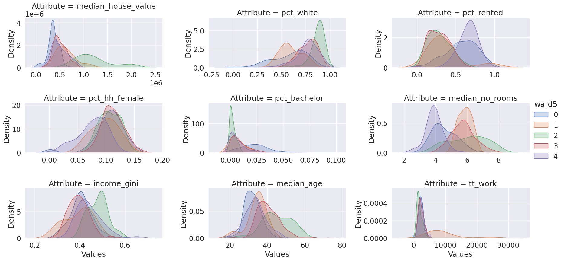
db["ward5"] = model.labels_
# Set up figure and ax
f, axs = plt.subplots(1, 2, figsize=(12, 6))
### K-Means ###
ax = axs[0]
# Plot unique values choropleth including
# a legend and with no boundary lines
db.plot(
column="ward5",
categorical=True,
cmap="Set2",
legend=True,
linewidth=0,
ax=ax,
)
# Remove axis
ax.set_axis_off()
# Add title
ax.set_title("K-Means solution ($k=5$)")
### AHC ###
ax = axs[1]
# Plot unique values choropleth including
# a legend and with no boundary lines
db.plot(
column="k5cls",
categorical=True,
cmap="Set3",
legend=True,
linewidth=0,
ax=ax,
)
# Remove axis
ax.set_axis_off()
# Add title
ax.set_title("AHC solution ($k=5$)")
# Display the map
plt.show()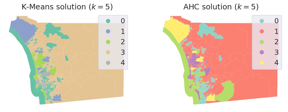
from sklearn.metrics import rand_scoreRand index
- \(a\) the number of pairs that are in the same cluster in K-Means and AHC
- \(b\) the number of pairs that are in different clusters in k-Means and in different subsets in AHC
- \(c\) the number of pairs that are in the same cluster in K-Means and in different clusters in AHC
- \(d\) the number of pairs that are in different clusters in K-Means and in the same cluster in AHC
\[R = \frac{a+b}{a+b+c+d} = \frac{a+b}{n(n-1)/2}\]
rand_score(db.k5cls, db.ward5)0.8152053556009305Silhouette Coefficient
- \(a\): The mean distance between a sample and all other points in the same cluster
- \(b\): The mean distance between a sample and all other points in the next nearest cluster.
\[s = \frac{b-a}{max(a,b)}\]
- \(-1 \le s \le 1\)
from sklearn.metrics import silhouette_scoresilhouette_score(db_scaled, db.k5cls)0.19290802579312513silhouette_score(db_scaled, db.ward5)0.16230352315230728from sklearn.metrics import silhouette_sampless_kmeans = silhouette_samples(db_scaled, db.k5cls)db['s_kmeans'] = s_kmeans
# Set up figure and ax
f, ax = plt.subplots(1, figsize=(9, 9))
# Plot unique values choropleth including
# a legend and with no boundary lines
db.plot(
column="s_kmeans", legend=True, linewidth=0, ax=ax
)
# Remove axis
ax.set_axis_off()
# Display the map
plt.show()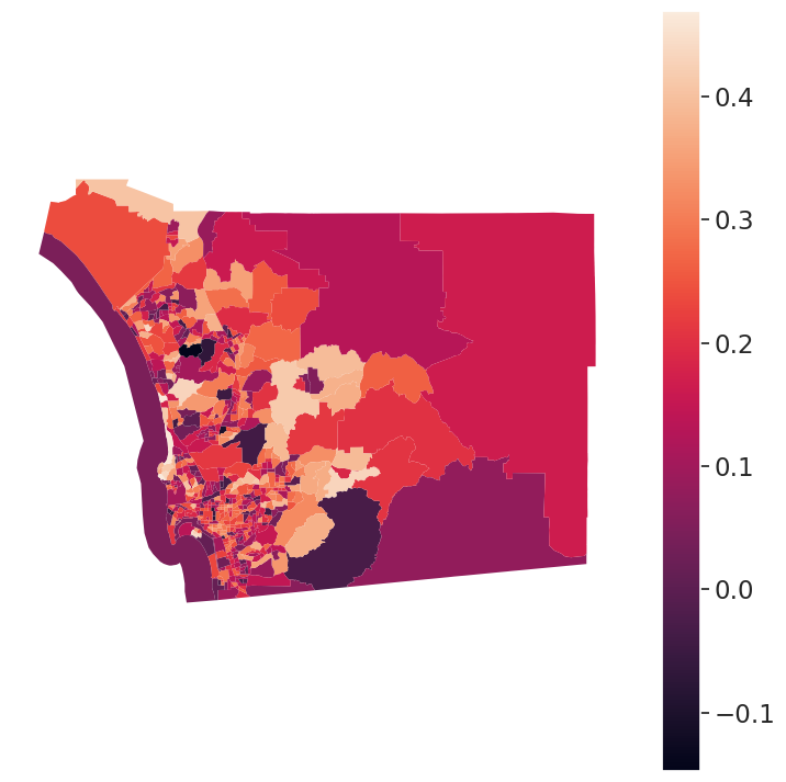
How many Clusters?
set a neighborhood size = 8000
db.total_pop.sum()3283665.0n_hoods = int(db.total_pop.sum() / 8000)n_hoods410kmeans = KMeans(n_clusters=n_hoods)
import numpy as np
np.random.seed(1234)
k410cls = kmeans.fit(db_scaled)# Assign labels into a column
db["k410cls"] = k410cls.labels_
# Set up figure and ax
f, ax = plt.subplots(1, figsize=(9, 9))
# Plot unique values choropleth including
# a legend and with no boundary lines
db.plot(
column="k410cls", categorical=True, legend=False, linewidth=0, ax=ax
)
# Remove axis
ax.set_axis_off()
# Display the map
plt.show()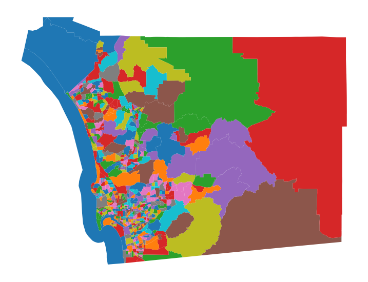
db.dissolve(by='k410cls').plot()<Axes: >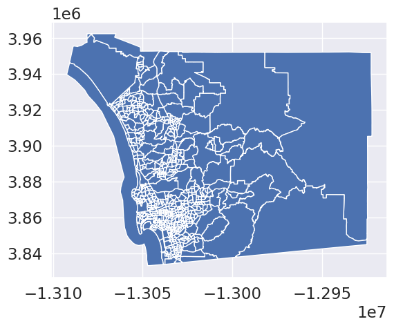
db.groupby(by='k410cls').count().sort_values(by='GEOID', ascending=False)| GEOID | median_age | total_pop | total_pop_white | tt_work | hh_total | hh_female | total_bachelor | median_hh_income | income_gini | ... | area_sqm | pct_rented | pct_hh_female | pct_bachelor | pct_white | sub_30 | geometry | k5cls | ward5 | s_kmeans | |
|---|---|---|---|---|---|---|---|---|---|---|---|---|---|---|---|---|---|---|---|---|---|
| k410cls | |||||||||||||||||||||
| 94 | 7 | 7 | 7 | 7 | 7 | 7 | 7 | 7 | 7 | 7 | ... | 7 | 7 | 7 | 7 | 7 | 7 | 7 | 7 | 7 | 7 |
| 7 | 6 | 6 | 6 | 6 | 6 | 6 | 6 | 6 | 6 | 6 | ... | 6 | 6 | 6 | 6 | 6 | 6 | 6 | 6 | 6 | 6 |
| 82 | 6 | 6 | 6 | 6 | 6 | 6 | 6 | 6 | 6 | 6 | ... | 6 | 6 | 6 | 6 | 6 | 6 | 6 | 6 | 6 | 6 |
| 264 | 5 | 5 | 5 | 5 | 5 | 5 | 5 | 5 | 5 | 5 | ... | 5 | 5 | 5 | 5 | 5 | 5 | 5 | 5 | 5 | 5 |
| 149 | 5 | 5 | 5 | 5 | 5 | 5 | 5 | 5 | 5 | 5 | ... | 5 | 5 | 5 | 5 | 5 | 5 | 5 | 5 | 5 | 5 |
| ... | ... | ... | ... | ... | ... | ... | ... | ... | ... | ... | ... | ... | ... | ... | ... | ... | ... | ... | ... | ... | ... |
| 179 | 1 | 1 | 1 | 1 | 1 | 1 | 1 | 1 | 1 | 1 | ... | 1 | 1 | 1 | 1 | 1 | 1 | 1 | 1 | 1 | 1 |
| 178 | 1 | 1 | 1 | 1 | 1 | 1 | 1 | 1 | 1 | 1 | ... | 1 | 1 | 1 | 1 | 1 | 1 | 1 | 1 | 1 | 1 |
| 177 | 1 | 1 | 1 | 1 | 1 | 1 | 1 | 1 | 1 | 1 | ... | 1 | 1 | 1 | 1 | 1 | 1 | 1 | 1 | 1 | 1 |
| 175 | 1 | 1 | 1 | 1 | 1 | 1 | 1 | 1 | 1 | 1 | ... | 1 | 1 | 1 | 1 | 1 | 1 | 1 | 1 | 1 | 1 |
| 409 | 1 | 1 | 1 | 1 | 1 | 1 | 1 | 1 | 1 | 1 | ... | 1 | 1 | 1 | 1 | 1 | 1 | 1 | 1 | 1 | 1 |
410 rows × 28 columns
db[db.k410cls==94].plot()<Axes: >
np.random.seed(0)
# Initialize the algorithm
model = AgglomerativeClustering(linkage="ward", n_clusters=n_hoods)
# Run clustering
model.fit(db_scaled)
# Assign labels to main data table
db["ward410"] = model.labels_silhouette_score(db_scaled, db.k410cls)0.09318913872845698silhouette_score(db_scaled, db.ward410)0.12442664189896505Regionalization
f, axs = plt.subplots(nrows=3, ncols=3, figsize=(12, 12))
# Make the axes accessible with single indexing
axs = axs.flatten()
# Start a loop over all the variables of interest
for i, col in enumerate(cluster_variables):
# select the axis where the map will go
ax = axs[i]
# Plot the map
db.plot(
column=col,
ax=ax,
scheme="Quantiles",
linewidth=0,
cmap="RdPu",
)
# Remove axis clutter
ax.set_axis_off()
# Set the axis title to the name of variable being plotted
ax.set_title(col)
# Display the figure
plt.show()
Moran’s I: Measuring Spatial Autocorrelation
from libpysal.weights import Queen
import numpy
w = Queen.from_dataframe(db)/tmp/ipykernel_3781400/1403424482.py:4: FutureWarning: `use_index` defaults to False but will default to True in future. Set True/False directly to control this behavior and silence this warning
w = Queen.from_dataframe(db)from esda.moran import Moran
# Set seed for reproducibility
numpy.random.seed(123456)
# Calculate Moran's I for each variable
mi_results = [
Moran(db[variable], w) for variable in cluster_variables
]
# Structure results as a list of tuples
mi_results = [
(variable, res.I, res.p_sim)
for variable, res in zip(cluster_variables, mi_results)
]
# Display on table
table = pandas.DataFrame(
mi_results, columns=["Variable", "Moran's I", "P-value"]
).set_index("Variable")
table| Moran's I | P-value | |
|---|---|---|
| Variable | ||
| median_house_value | 0.646618 | 0.001 |
| pct_white | 0.602079 | 0.001 |
| pct_rented | 0.451372 | 0.001 |
| pct_hh_female | 0.282239 | 0.001 |
| pct_bachelor | 0.433082 | 0.001 |
| median_no_rooms | 0.538996 | 0.001 |
| income_gini | 0.295064 | 0.001 |
| median_age | 0.381440 | 0.001 |
| tt_work | 0.102748 | 0.001 |
Wards with Contiguity Constraint
# Set the seed for reproducibility
np.random.seed(123456)
# Specify cluster model with spatial constraint
model = AgglomerativeClustering(
linkage="ward", connectivity=w.sparse, n_clusters=5
)
# Fit algorithm to the data
model.fit(db_scaled)AgglomerativeClustering(connectivity=<628x628 sparse matrix of type '<class 'numpy.float64'>'
with 4016 stored elements in Compressed Sparse Row format>,
n_clusters=5)In a Jupyter environment, please rerun this cell to show the HTML representation or trust the notebook. On GitHub, the HTML representation is unable to render, please try loading this page with nbviewer.org.
AgglomerativeClustering(connectivity=<628x628 sparse matrix of type '<class 'numpy.float64'>'
with 4016 stored elements in Compressed Sparse Row format>,
n_clusters=5)db["ward5wq"] = model.labels_
# Set up figure and ax
f, ax = plt.subplots(1, figsize=(9, 9))
# Plot unique values choropleth including a legend and with no boundary lines
db.plot(
column="ward5wq",
categorical=True,
legend=True,
linewidth=0,
ax=ax,
)
# Remove axis
ax.set_axis_off()
# Display the map
plt.show()
Max-p
Future studies should consider consolidating counties using regionalization methods.57, 58 Salerno et al. 2024
Future studies should consider regionalization methods, such as the Max-P-regions model23, to combine counties with small numbers of cases. Dong et al. 2023
Actually doing it: 
from spopt.region import MaxPHeuristic as MaxPdb.total_pop0 2590.0
1 5147.0
2 5595.0
3 7026.0
4 40402.0
...
623 7848.0
624 3624.0
625 5261.0
626 3065.0
627 2693.0
Name: total_pop, Length: 628, dtype: float64model = MaxP(db, w, cluster_variables, 'total_pop', 8000, top_n=2)np.random.seed(1234)
model.solve()db['maxp'] = model.labels_db.groupby(by='maxp').count()| GEOID | median_age | total_pop | total_pop_white | tt_work | hh_total | hh_female | total_bachelor | median_hh_income | income_gini | ... | pct_bachelor | pct_white | sub_30 | geometry | k5cls | ward5 | s_kmeans | k410cls | ward410 | ward5wq | |
|---|---|---|---|---|---|---|---|---|---|---|---|---|---|---|---|---|---|---|---|---|---|
| maxp | |||||||||||||||||||||
| 1 | 2 | 2 | 2 | 2 | 2 | 2 | 2 | 2 | 2 | 2 | ... | 2 | 2 | 2 | 2 | 2 | 2 | 2 | 2 | 2 | 2 |
| 2 | 4 | 4 | 4 | 4 | 4 | 4 | 4 | 4 | 4 | 4 | ... | 4 | 4 | 4 | 4 | 4 | 4 | 4 | 4 | 4 | 4 |
| 3 | 3 | 3 | 3 | 3 | 3 | 3 | 3 | 3 | 3 | 3 | ... | 3 | 3 | 3 | 3 | 3 | 3 | 3 | 3 | 3 | 3 |
| 4 | 2 | 2 | 2 | 2 | 2 | 2 | 2 | 2 | 2 | 2 | ... | 2 | 2 | 2 | 2 | 2 | 2 | 2 | 2 | 2 | 2 |
| 5 | 3 | 3 | 3 | 3 | 3 | 3 | 3 | 3 | 3 | 3 | ... | 3 | 3 | 3 | 3 | 3 | 3 | 3 | 3 | 3 | 3 |
| ... | ... | ... | ... | ... | ... | ... | ... | ... | ... | ... | ... | ... | ... | ... | ... | ... | ... | ... | ... | ... | ... |
| 275 | 2 | 2 | 2 | 2 | 2 | 2 | 2 | 2 | 2 | 2 | ... | 2 | 2 | 2 | 2 | 2 | 2 | 2 | 2 | 2 | 2 |
| 276 | 2 | 2 | 2 | 2 | 2 | 2 | 2 | 2 | 2 | 2 | ... | 2 | 2 | 2 | 2 | 2 | 2 | 2 | 2 | 2 | 2 |
| 277 | 2 | 2 | 2 | 2 | 2 | 2 | 2 | 2 | 2 | 2 | ... | 2 | 2 | 2 | 2 | 2 | 2 | 2 | 2 | 2 | 2 |
| 278 | 2 | 2 | 2 | 2 | 2 | 2 | 2 | 2 | 2 | 2 | ... | 2 | 2 | 2 | 2 | 2 | 2 | 2 | 2 | 2 | 2 |
| 279 | 2 | 2 | 2 | 2 | 2 | 2 | 2 | 2 | 2 | 2 | ... | 2 | 2 | 2 | 2 | 2 | 2 | 2 | 2 | 2 | 2 |
279 rows × 31 columns
db.plot(column='maxp', categorical=True)<Axes: >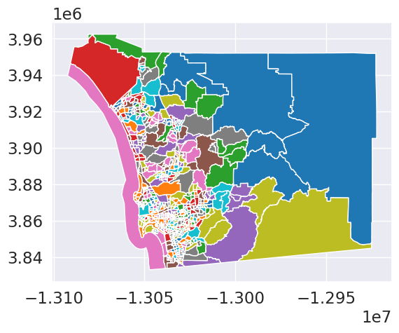
db.explore(column='maxp', tooltip=['maxp', 'total_pop'])Make this Notebook Trusted to load map: File -> Trust Notebook
summary = db[['maxp', 'total_pop']].groupby(by='maxp').sum()summary.head()| total_pop | |
|---|---|
| maxp | |
| 1 | 10245.0 |
| 2 | 19651.0 |
| 3 | 10957.0 |
| 4 | 13258.0 |
| 5 | 12708.0 |
summary.total_pop.describe()count 279.000000
mean 11769.408602
std 3733.528006
min 8007.000000
25% 9620.000000
50% 10868.000000
75% 12841.500000
max 43376.000000
Name: total_pop, dtype: float64maxp_hoods = db[['geometry', 'maxp']].dissolve(by='maxp')maxp_hoods.explore()Make this Notebook Trusted to load map: File -> Trust Notebook
import toblerres = tobler.area_weighted.area_interpolate(db, maxp_hoods, extensive_variables=['total_pop'],
intensive_variables=['pct_white'])res.plot(column='pct_white', cmap='Blues', legend=True, scheme='quantiles')<Axes: >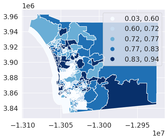
res.explore(column='pct_white')Make this Notebook Trusted to load map: File -> Trust Notebook