Statistical Visualization of Area Unit Data
Areal Unit Data
import geopandasimport libpysal
/tmp/ipykernel_326488/1387931905.py:1: UserWarning:
Shapely 2.0 is installed, but because PyGEOS is also installed, GeoPandas will still use PyGEOS by default for now. To force to use and test Shapely 2.0, you have to set the environment variable USE_PYGEOS=0. You can do this before starting the Python process, or in your code before importing geopandas:
import os
os.environ['USE_PYGEOS'] = '0'
import geopandas
In a future release, GeoPandas will switch to using Shapely by default. If you are using PyGEOS directly (calling PyGEOS functions on geometries from GeoPandas), this will then stop working and you are encouraged to migrate from PyGEOS to Shapely 2.0 (https://shapely.readthedocs.io/en/latest/migration_pygeos.html).
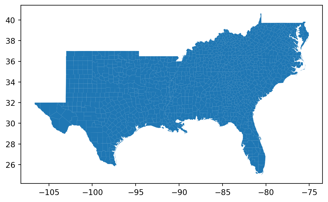
= libpysal.examples.load_example('South' )
'South' )
= geopandas.read_file(south.get_path('south.shp' ))
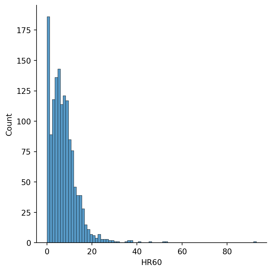
= 'HR60' )
<seaborn.axisgrid.FacetGrid at 0x7fab3d5335e0>
= 'HR60' )
Make this Notebook Trusted to load map: File -> Trust Notebook
count 1412.000000
mean 7.292144
std 6.421018
min 0.000000
25% 3.213471
50% 6.245125
75% 9.956272
max 92.936803
Name: HR60, dtype: float64
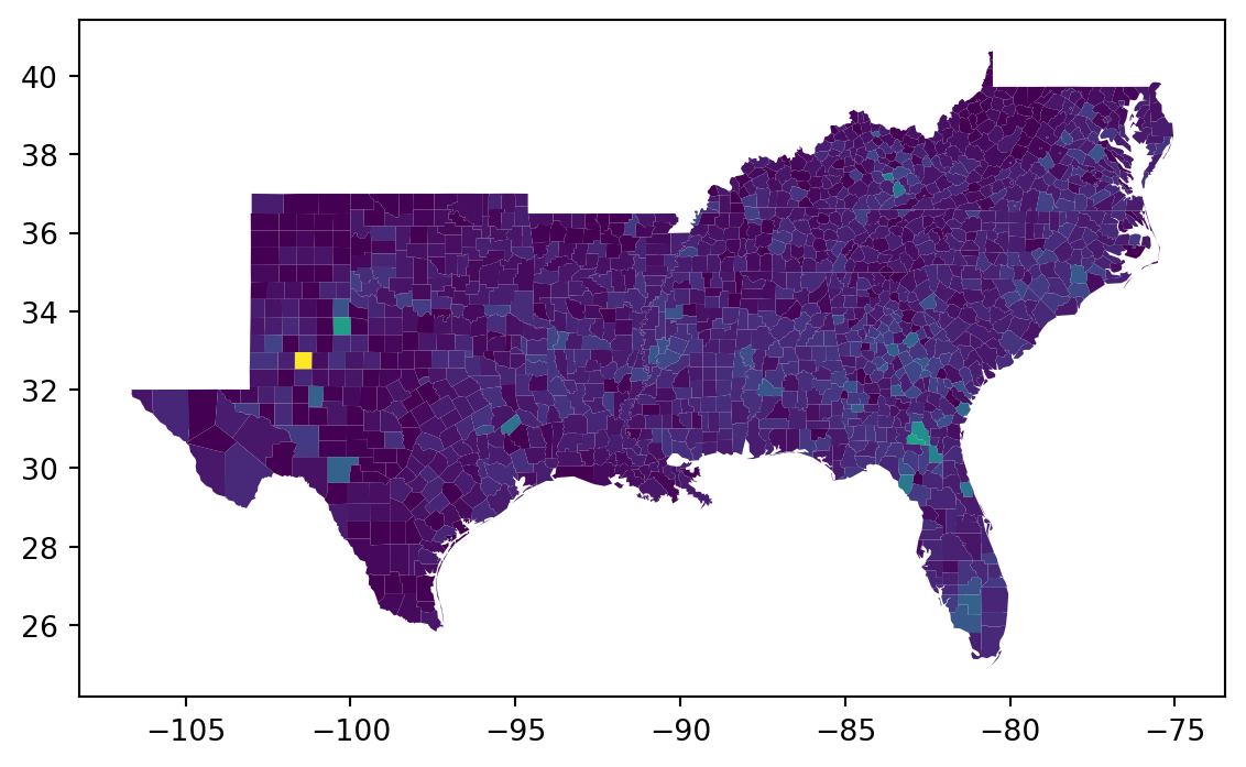
= 'HR60' )
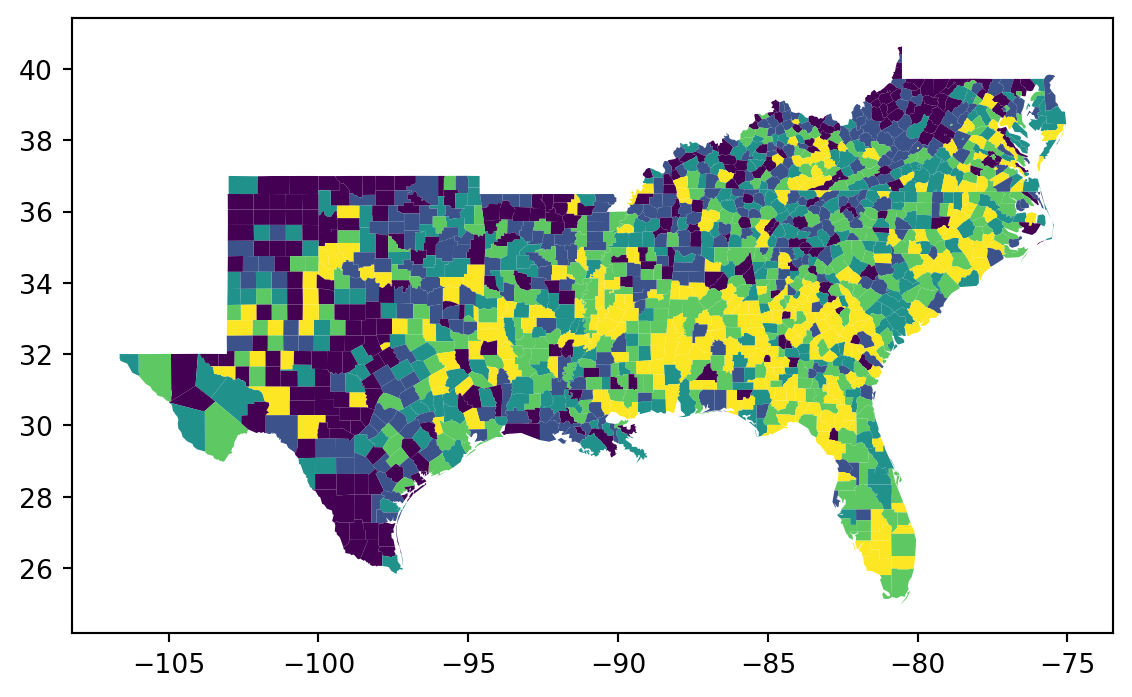
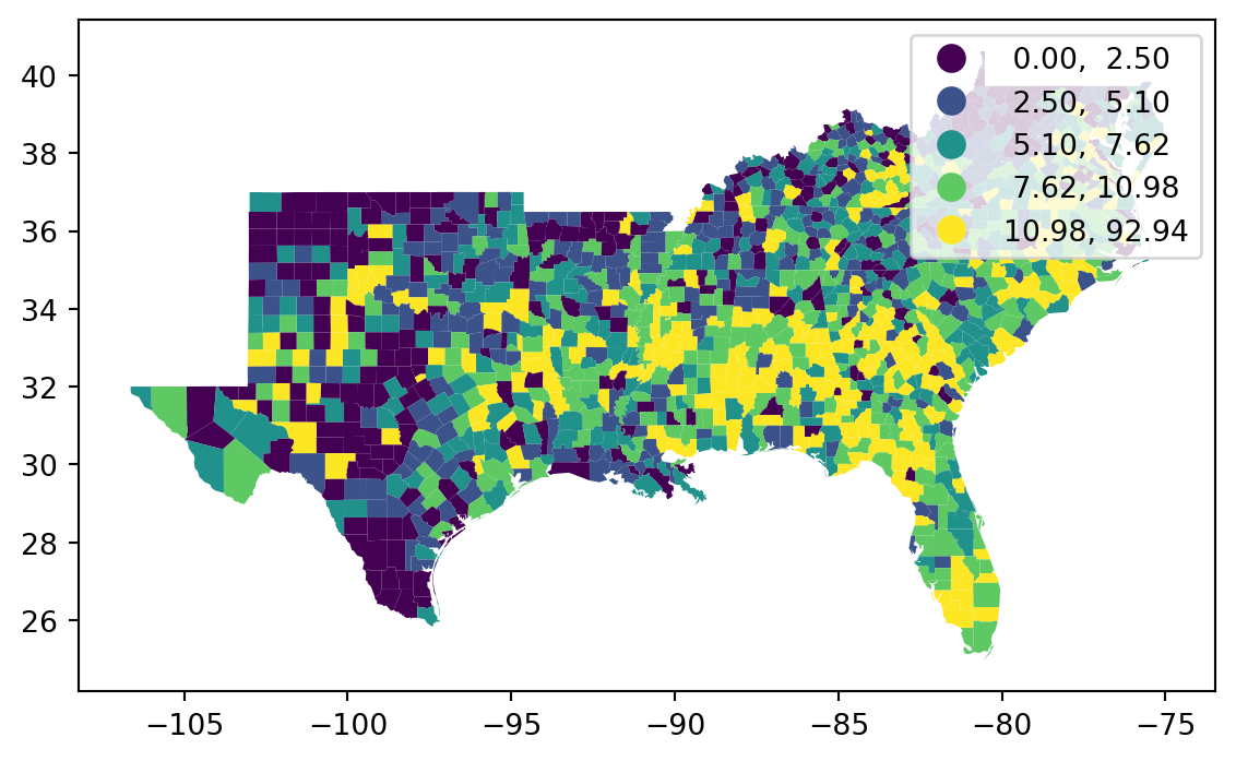
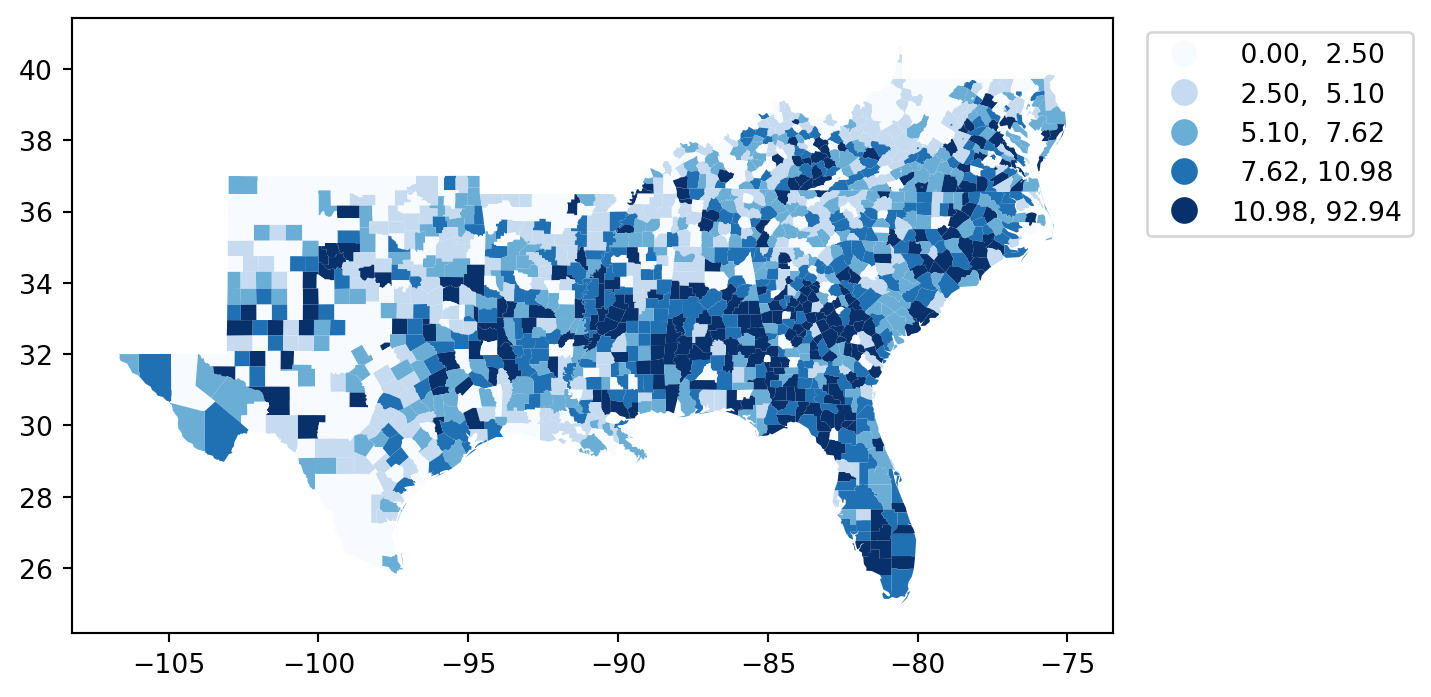
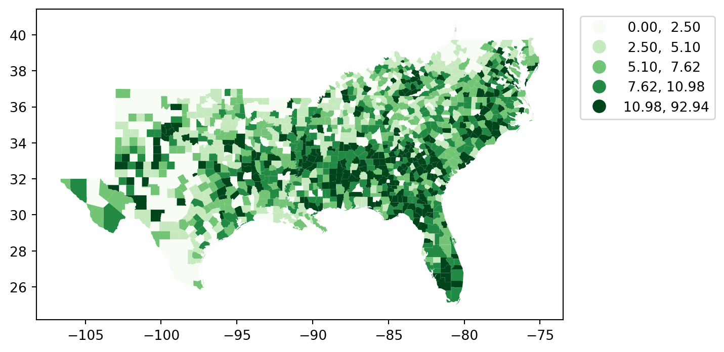
= 'HR60' , scheme= 'Quantiles' )
= 'HR60' , scheme= 'Quantiles' , legend= True )
Classification Schemes
\[c_j \lt y_i \le c_{j+1} \forall y_i \in C_j\]
where \(y_i\) is the value for the attribute at location \(i\) , \(j\) is a class index, and \(c_j\) represents the lower bound of interval \(j\) .
Quantiles
Interval Count
----------------------
[ 0.00, 2.50] | 283
( 2.50, 5.10] | 282
( 5.10, 7.62] | 282
( 7.62, 10.98] | 282
(10.98, 92.94] | 283
= 10 )
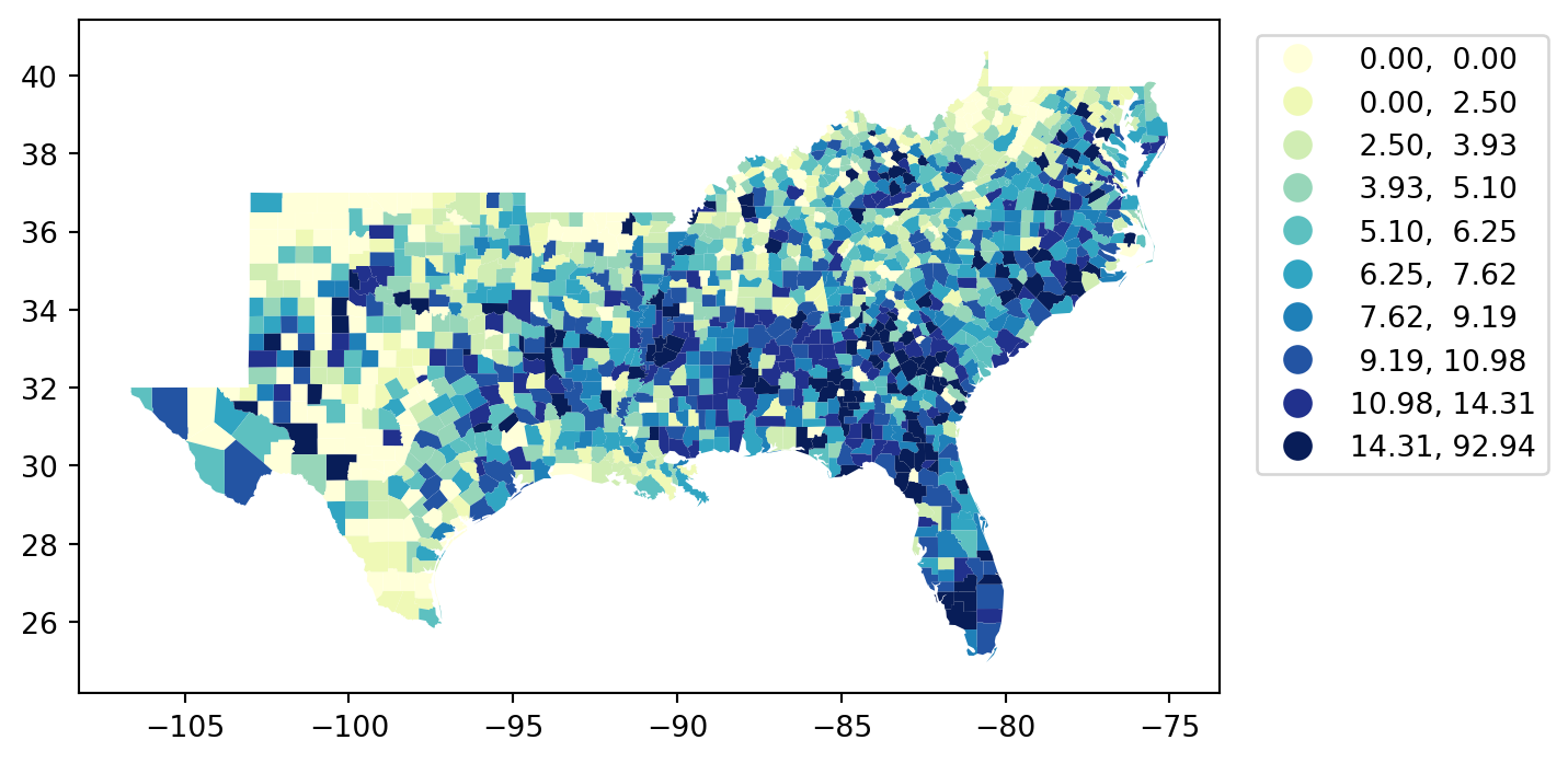
Quantiles
Interval Count
----------------------
[ 0.00, 0.00] | 180
( 0.00, 2.50] | 103
( 2.50, 3.93] | 141
( 3.93, 5.10] | 141
( 5.10, 6.25] | 141
( 6.25, 7.62] | 141
( 7.62, 9.19] | 141
( 9.19, 10.98] | 141
(10.98, 14.31] | 141
(14.31, 92.94] | 142
= 10 )
EqualInterval
Interval Count
----------------------
[ 0.00, 9.29] | 1000
( 9.29, 18.59] | 358
(18.59, 27.88] | 39
(27.88, 37.17] | 8
(37.17, 46.47] | 4
(46.47, 55.76] | 2
(55.76, 65.06] | 0
(65.06, 74.35] | 0
(74.35, 83.64] | 0
(83.64, 92.94] | 1
= 10 )
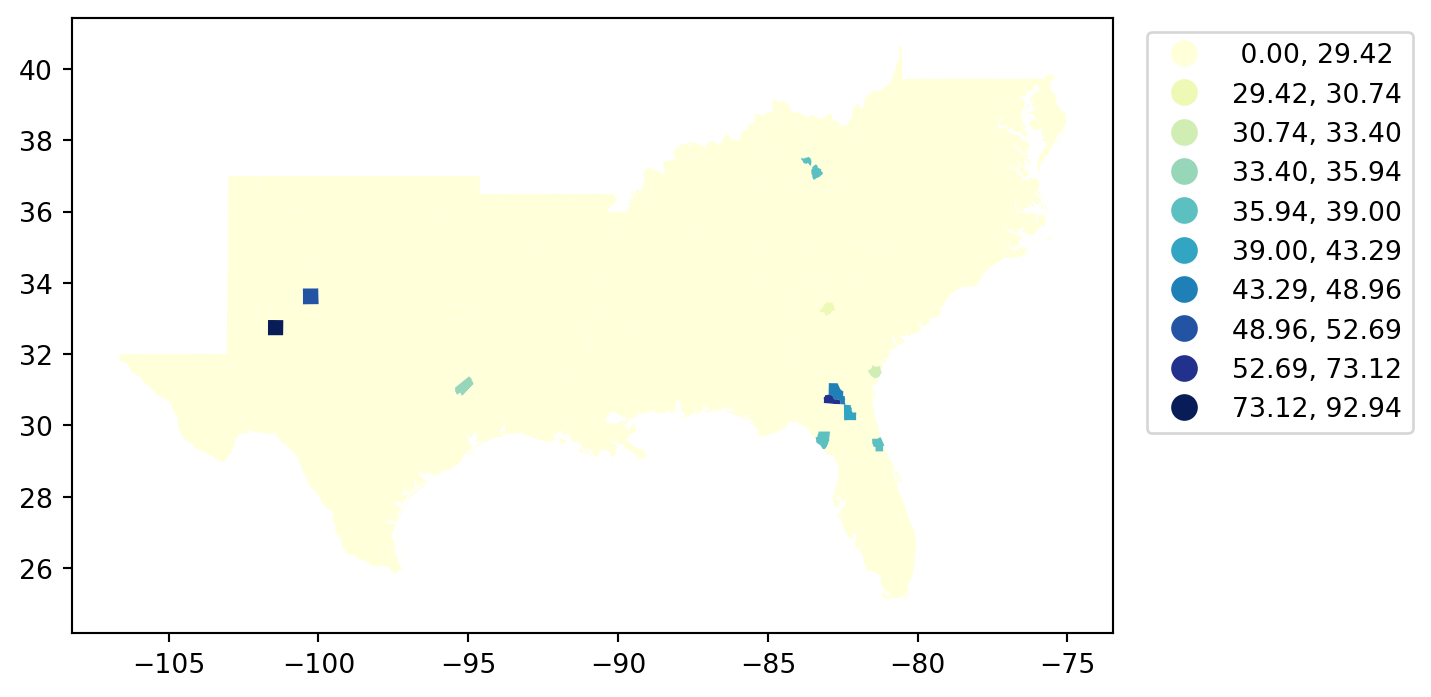
MaximumBreaks
Interval Count
----------------------
[ 0.00, 29.42] | 1400
(29.42, 30.74] | 1
(30.74, 33.40] | 1
(33.40, 35.94] | 1
(35.94, 39.00] | 4
(39.00, 43.29] | 1
(43.29, 48.96] | 1
(48.96, 52.69] | 1
(52.69, 73.12] | 1
(73.12, 92.94] | 1
= 10 )
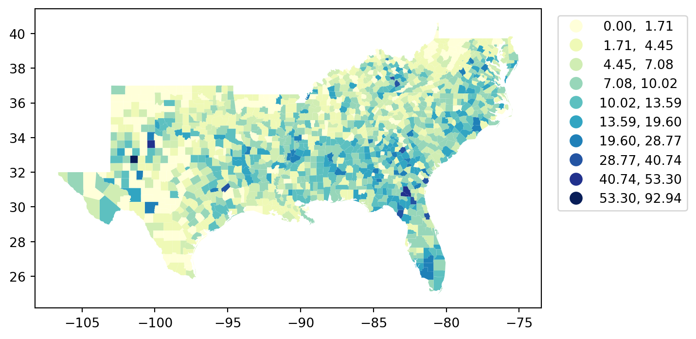
FisherJenks
Interval Count
----------------------
[ 0.00, 1.71] | 216
( 1.71, 4.45] | 278
( 4.45, 7.08] | 287
( 7.08, 10.02] | 288
(10.02, 13.59] | 176
(13.59, 19.60] | 121
(19.60, 28.77] | 34
(28.77, 40.74] | 8
(40.74, 53.30] | 3
(53.30, 92.94] | 1
BoxPlot
Interval Count
----------------------
( -inf, -6.90] | 0
(-6.90, 3.21] | 353
( 3.21, 6.25] | 353
( 6.25, 9.96] | 353
( 9.96, 20.07] | 311
(20.07, 92.94] | 42
HeadTailBreaks
Interval Count
----------------------
[ 0.00, 7.29] | 802
( 7.29, 12.41] | 405
(12.41, 18.18] | 147
(18.18, 26.87] | 40
(26.87, 38.73] | 13
(38.73, 56.98] | 4
(56.98, 92.94] | 1
Map Customization
Legends
'STATE_NAME' , 'HR60' , 'HR90' ]].head()
STATE_NAME
HR60
HR90
0
West Virginia
1.682864
0.946083
1
West Virginia
4.607233
1.234934
2
West Virginia
0.974132
2.621009
3
West Virginia
0.876248
4.461577
4
Delaware
4.228385
6.712736
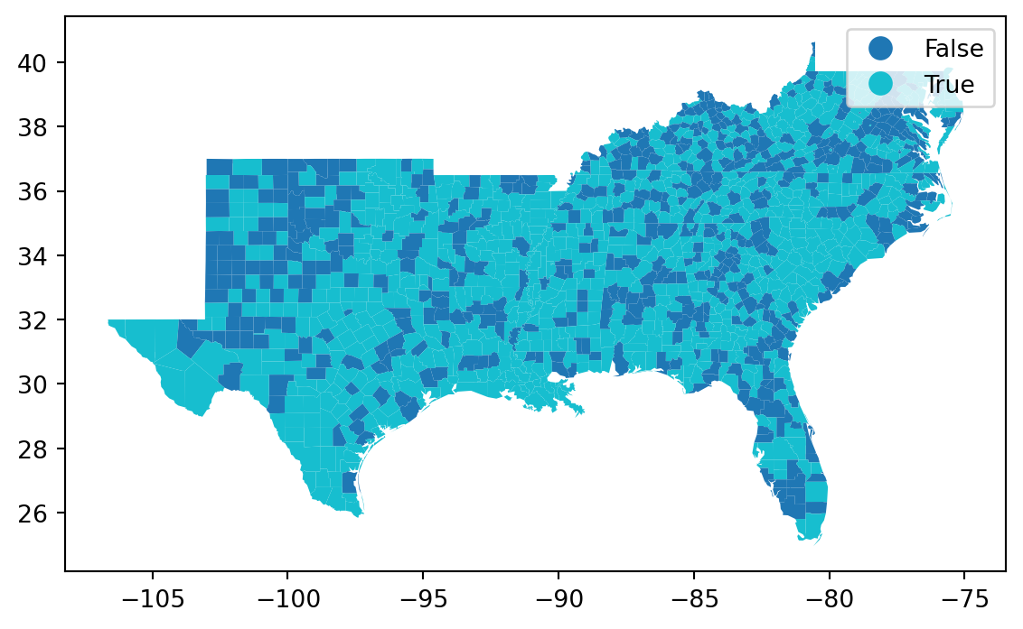
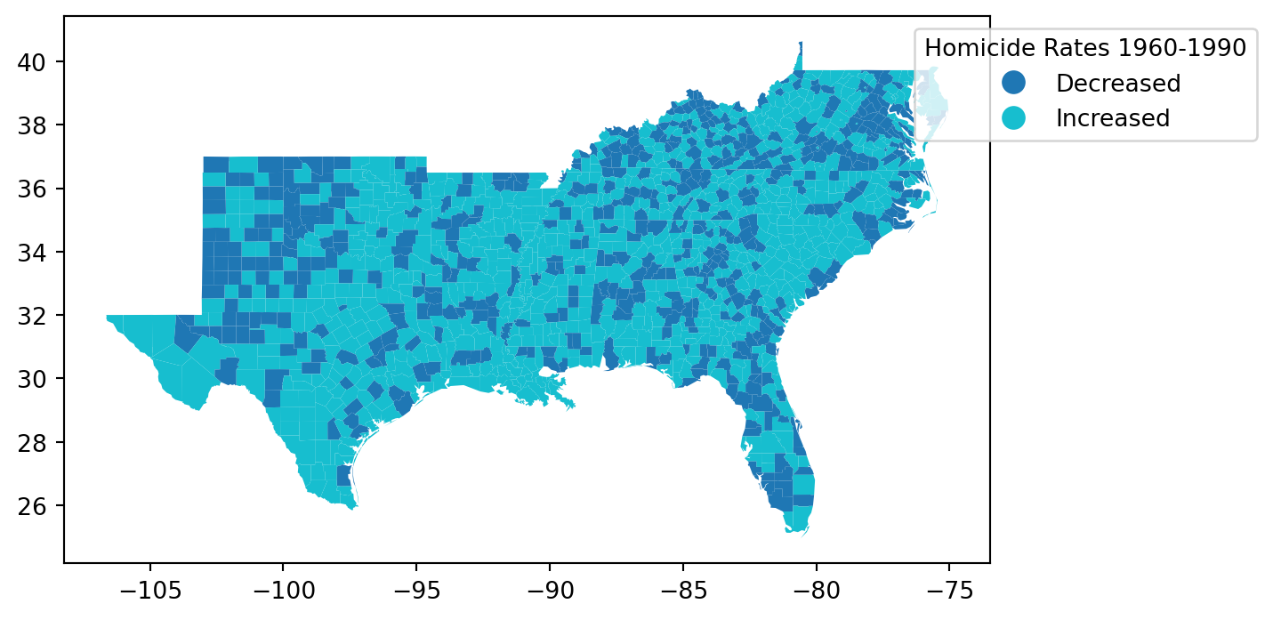
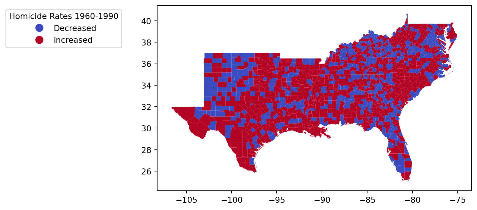
'increased' ] = south_gdf.HR90 > south_gdf.HR60
= 'increased' , categorical= True , legend= True );
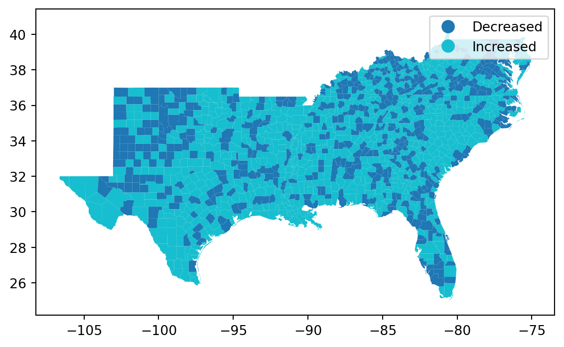
= south_gdf.increased.map ({True : 'Increased' , False : 'Decreased' })
'Increased' ] = v
= 'Increased' , categorical= True , legend= True );
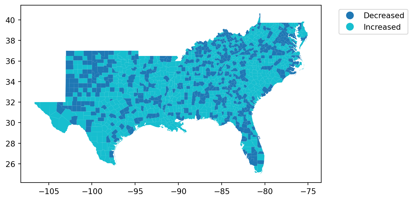
= 'Increased' , categorical= True , legend= True ,= {'bbox_to_anchor' : (1.3 , 1 )});
= 'Increased' , categorical= True , legend= True ,= {'bbox_to_anchor' : (1.3 , 1 ),'title' :'Homicide Rates 1960-1990' },;
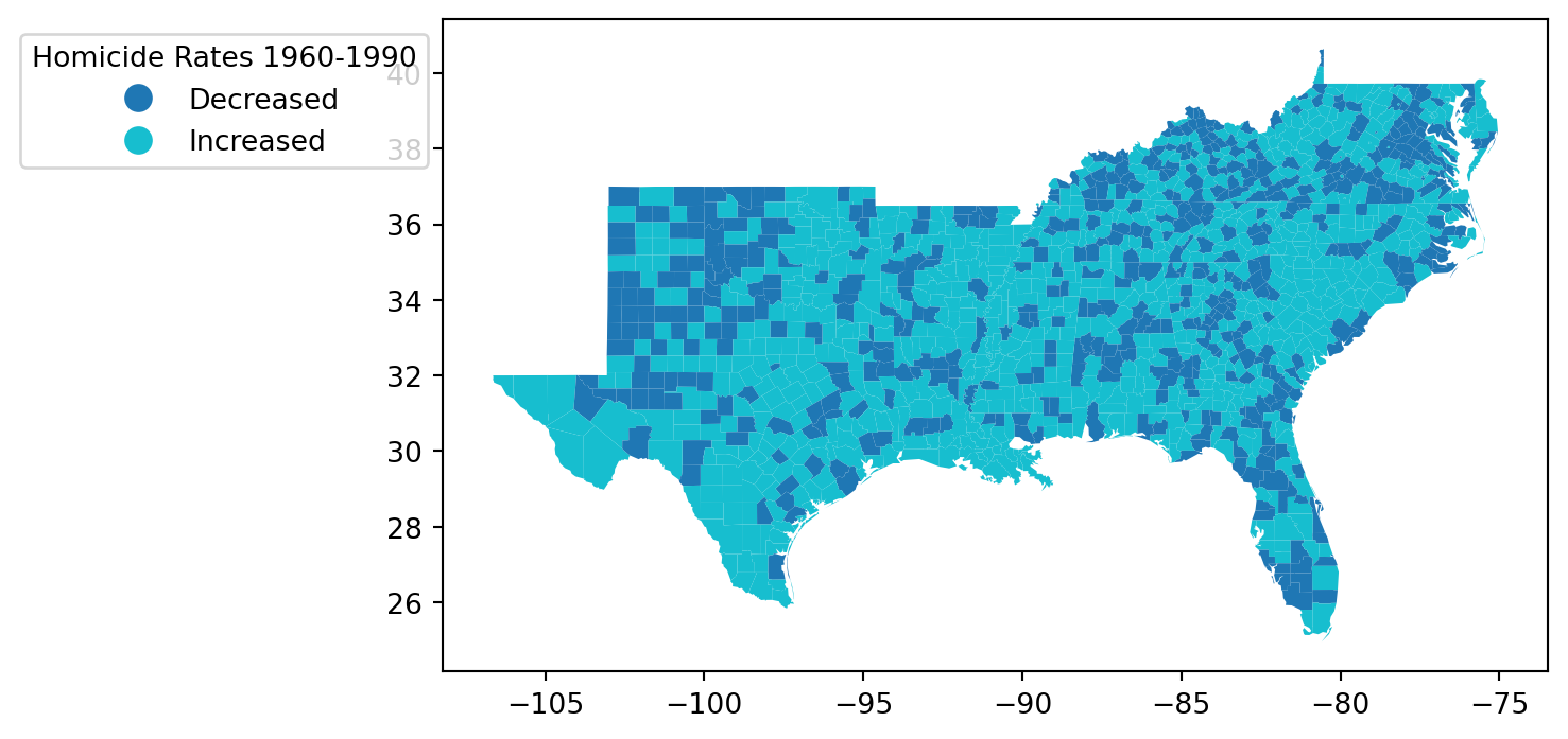
= 'Increased' , categorical= True , legend= True ,= {'bbox_to_anchor' : (0 , 1 ),'title' :'Homicide Rates 1960-1990' },;
= 'Increased' , categorical= True , legend= True ,= {'bbox_to_anchor' : (- 0.1 , 1 ),'title' :'Homicide Rates 1960-1990' },;
Color schemes
For more info see matplotlib
Sequential Color Schemes
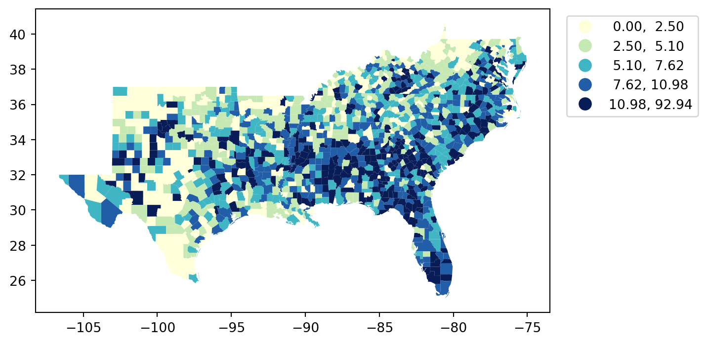
= 'HR60' , scheme= 'Quantiles' , legend= True , = {'bbox_to_anchor' : (1.3 , 1 )},= 'Blues' );
= 'HR60' , scheme= 'Quantiles' , legend= True , = {'bbox_to_anchor' : (1.3 , 1 )},= 'Greens' );
= 'HR60' , scheme= 'Quantiles' , legend= True , = {'bbox_to_anchor' : (1.3 , 1 )},= 'YlGnBu' );
Diverging Color Schme
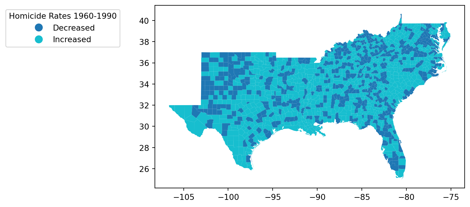
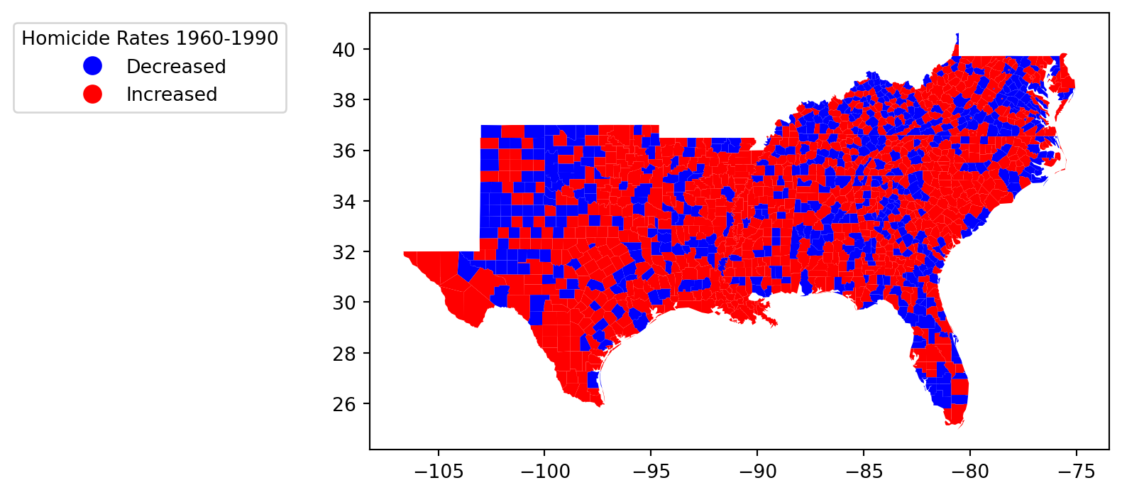
= 'Increased' , categorical= True , legend= True ,= {'bbox_to_anchor' : (- 0.1 , 1 ),'title' :'Homicide Rates 1960-1990' },= 'coolwarm' ,;
= 'Increased' , categorical= True , legend= True ,= {'bbox_to_anchor' : (- 0.1 , 1 ),'title' :'Homicide Rates 1960-1990' },= 'bwr' ,;
Qualitative Color Scheme
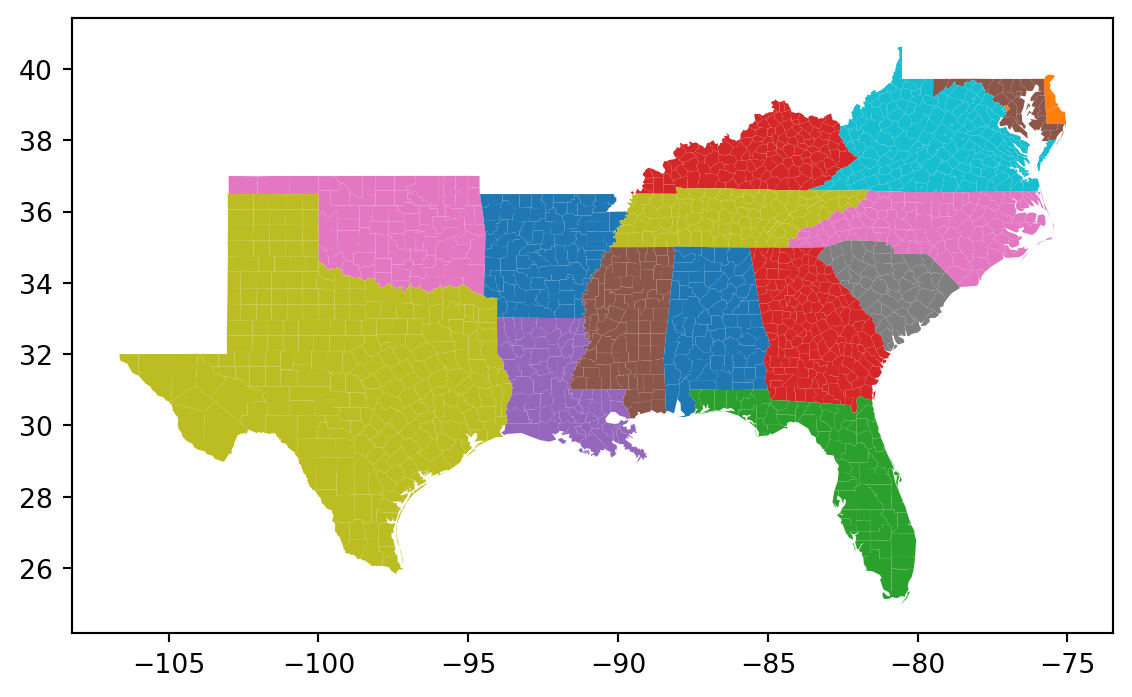
= 'STATE_NAME' , categorical= True )
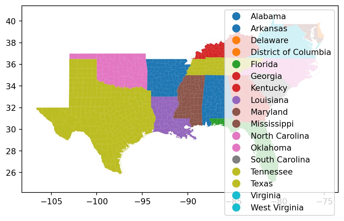
= 'STATE_NAME' , categorical= True , legend= True )
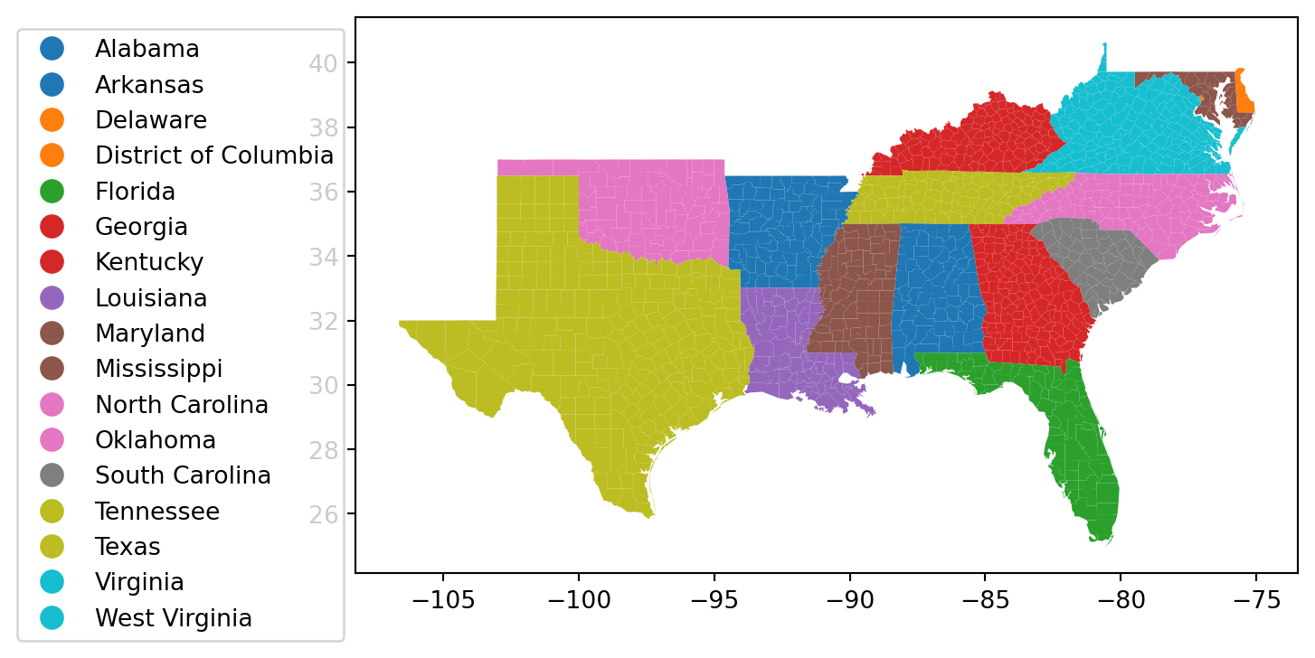
= 'STATE_NAME' , categorical= True , legend= True ,= {'bbox_to_anchor' : (0 , 1 )})
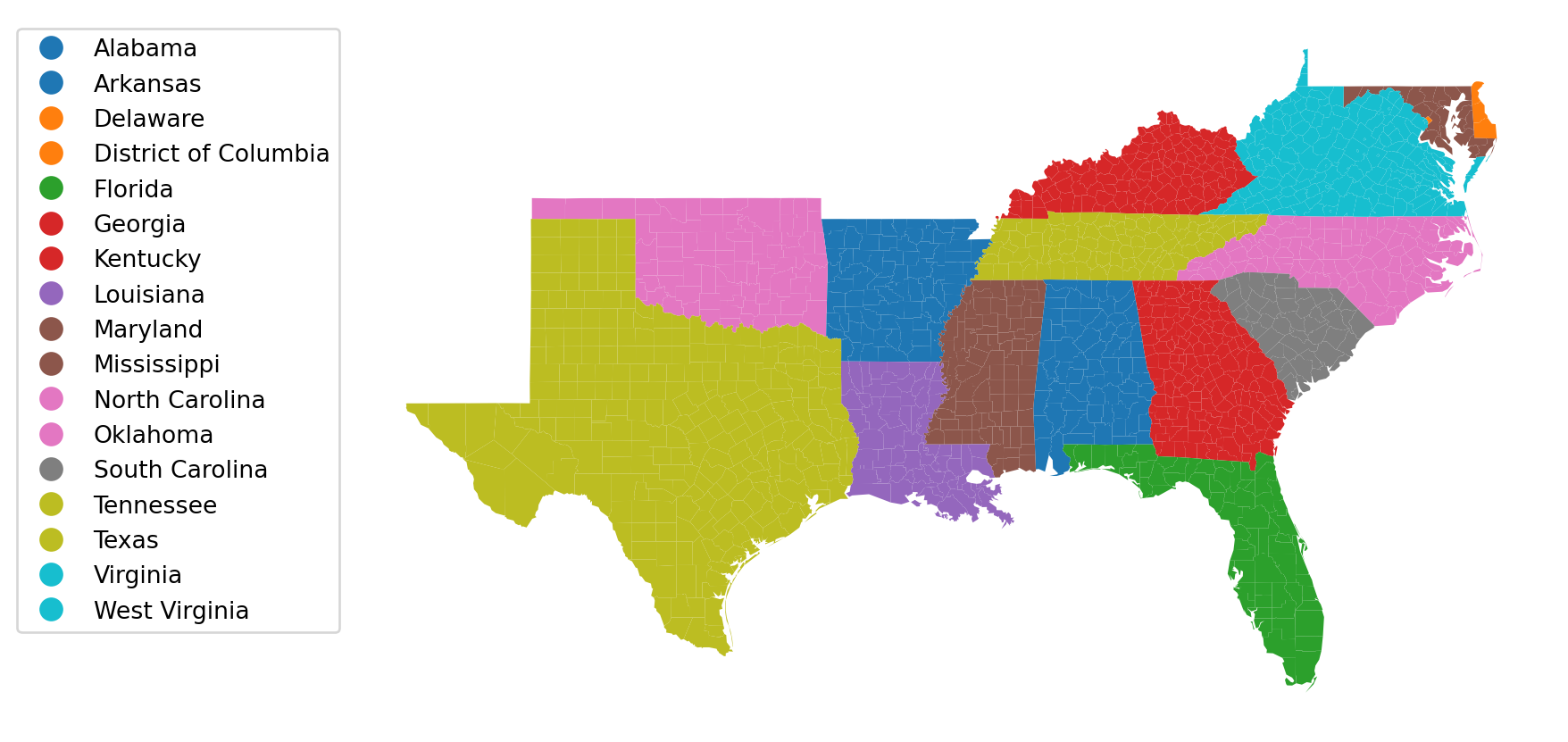
import matplotlib.pyplot as plt= plt.figure()= fig.add_axes([0 , 0 , 1 , 1 ])'off' )= 'STATE_NAME' , categorical= True , legend= True ,= {'bbox_to_anchor' : (0 , 1 )}, ax= ax);
Comparisons (Sequential)
= 'HR60' , scheme= 'Quantiles' , legend= True , = {'bbox_to_anchor' : (1.3 , 1 )},= 'YlGnBu' , k= 10 );
= 'HR60' , scheme= 'MaximumBreaks' , legend= True , = {'bbox_to_anchor' : (1.3 , 1 )},= 'YlGnBu' , k= 10 );
= 'HR60' , scheme= 'FisherJenks' , legend= True , = {'bbox_to_anchor' : (1.3 , 1 )},= 'YlGnBu' , k= 10 );